

(c)2025 Shanghai Evenage Business Consulting Co., Ltd. All Rights Reserved.
Business License: 9 131 0000MA1JN8DD25
Business License: 9 131 0000MA1JN8DD25
FINTECH BRANDING · BRAND STRATEGY & VISUAL IDENTITY
Casheer: Reimagining the Cashier for a Digital World
Brand Strategy · Brand Identity · Visual Concept · Digital Design · Brand Applications
What If Digital Finance Felt Simple?
Financial technology is becoming more powerful, but for many businesses, it is also becoming more complicated. Casheer set out to change that.
Working with One Global, we developed the brand strategy and visual identity for Casheer — a financial platform created to simplify payments, invoicing, financial data and everyday transactions for businesses of different sizes.
The ambition was to make sophisticated financial technology feel accessible without making the brand feel simplistic. Casheer needed to speak to startups and growing businesses as naturally as it could to larger international companies: confident enough for finance, progressive enough for technology, and intuitive enough for everyday use.
That challenge gave us the central idea behind the brand: everything can always be made easier.
Financial technology is becoming more powerful, but for many businesses, it is also becoming more complicated. Casheer set out to change that.
Working with One Global, we developed the brand strategy and visual identity for Casheer — a financial platform created to simplify payments, invoicing, financial data and everyday transactions for businesses of different sizes.
The ambition was to make sophisticated financial technology feel accessible without making the brand feel simplistic. Casheer needed to speak to startups and growing businesses as naturally as it could to larger international companies: confident enough for finance, progressive enough for technology, and intuitive enough for everyday use.
That challenge gave us the central idea behind the brand: everything can always be made easier.

From the Traditional Cashier to a Digital Partner
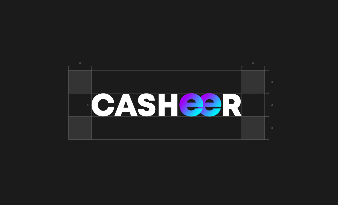
The story started with the name itself.
For generations, the cashier has stood at the point where businesses and customers meet. More than someone handling a payment, a good cashier represented competence, reliability and trust — someone who understood the transaction and made the process feel effortless.
As transactions move increasingly into digital environments, that human role may be disappearing, but the need for those qualities is not. Casheer takes that familiar idea and reimagines it for a new financial landscape.
We built the strategy around translating trust, simplicity and understanding into a digital experience. Instead of asking businesses to navigate increasingly complicated financial systems, Casheer would become the intelligent partner that makes those systems easier to use.
The story started with the name itself.
For generations, the cashier has stood at the point where businesses and customers meet. More than someone handling a payment, a good cashier represented competence, reliability and trust — someone who understood the transaction and made the process feel effortless.
As transactions move increasingly into digital environments, that human role may be disappearing, but the need for those qualities is not. Casheer takes that familiar idea and reimagines it for a new financial landscape.
We built the strategy around translating trust, simplicity and understanding into a digital experience. Instead of asking businesses to navigate increasingly complicated financial systems, Casheer would become the intelligent partner that makes those systems easier to use.

One Point. Infinite Directions.
How do you visualize simplicity and growth at the same time?
Our answer became Organic Growth — the central visual concept behind the Casheer identity.
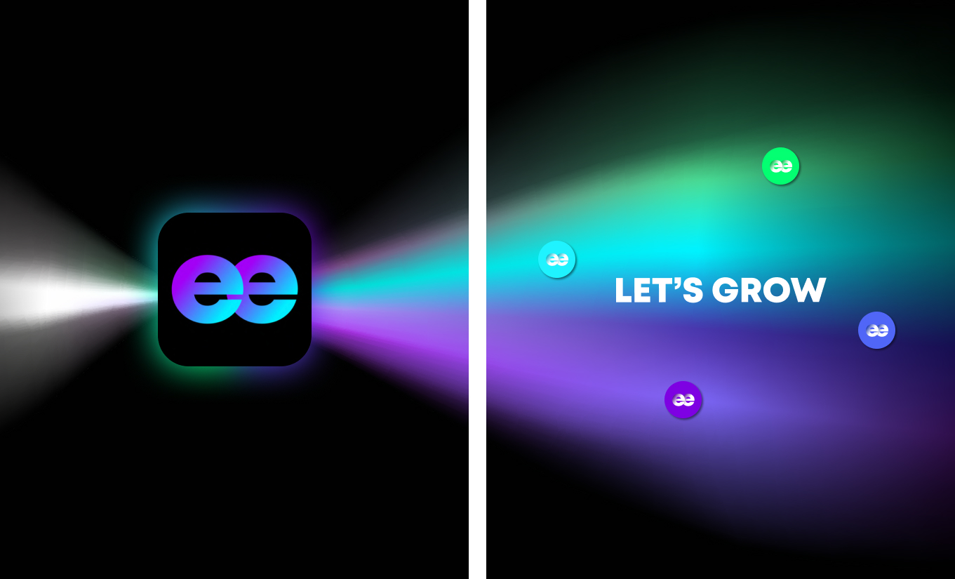
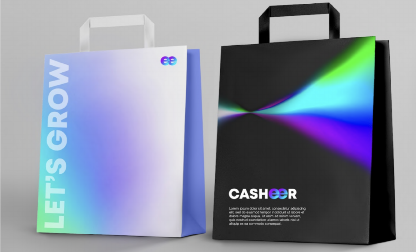
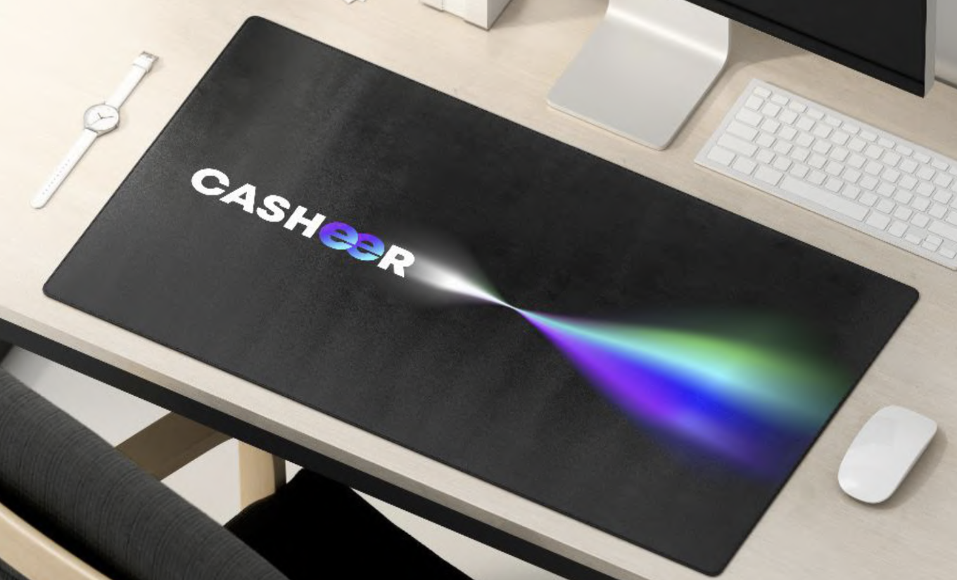
The graphic language begins with a single point, representing the moment a business connects with Casheer. From there, light, colour and movement expand outward in different directions. What begins as something concentrated and simple develops into something much larger — a visual metaphor for connection, speed and business growth.
The result is a visual world that feels constantly in motion without becoming visually complicated. Fluid gradients and luminous forms bring energy to the identity, while generous space and simple geometry keep the system clear and controlled.
How do you visualize simplicity and growth at the same time?
Our answer became Organic Growth — the central visual concept behind the Casheer identity.
The graphic language begins with a single point, representing the moment a business connects with Casheer. From there, light, colour and movement expand outward in different directions. What begins as something concentrated and simple develops into something much larger — a visual metaphor for connection, speed and business growth.
The result is a visual world that feels constantly in motion without becoming visually complicated. Fluid gradients and luminous forms bring energy to the identity, while generous space and simple geometry keep the system clear and controlled.

Making Finance Look Less Financial
Fintech branding can easily fall into a familiar visual language of corporate blues, rigid grids and predictable technology graphics. For Casheer, we wanted something more distinctive.
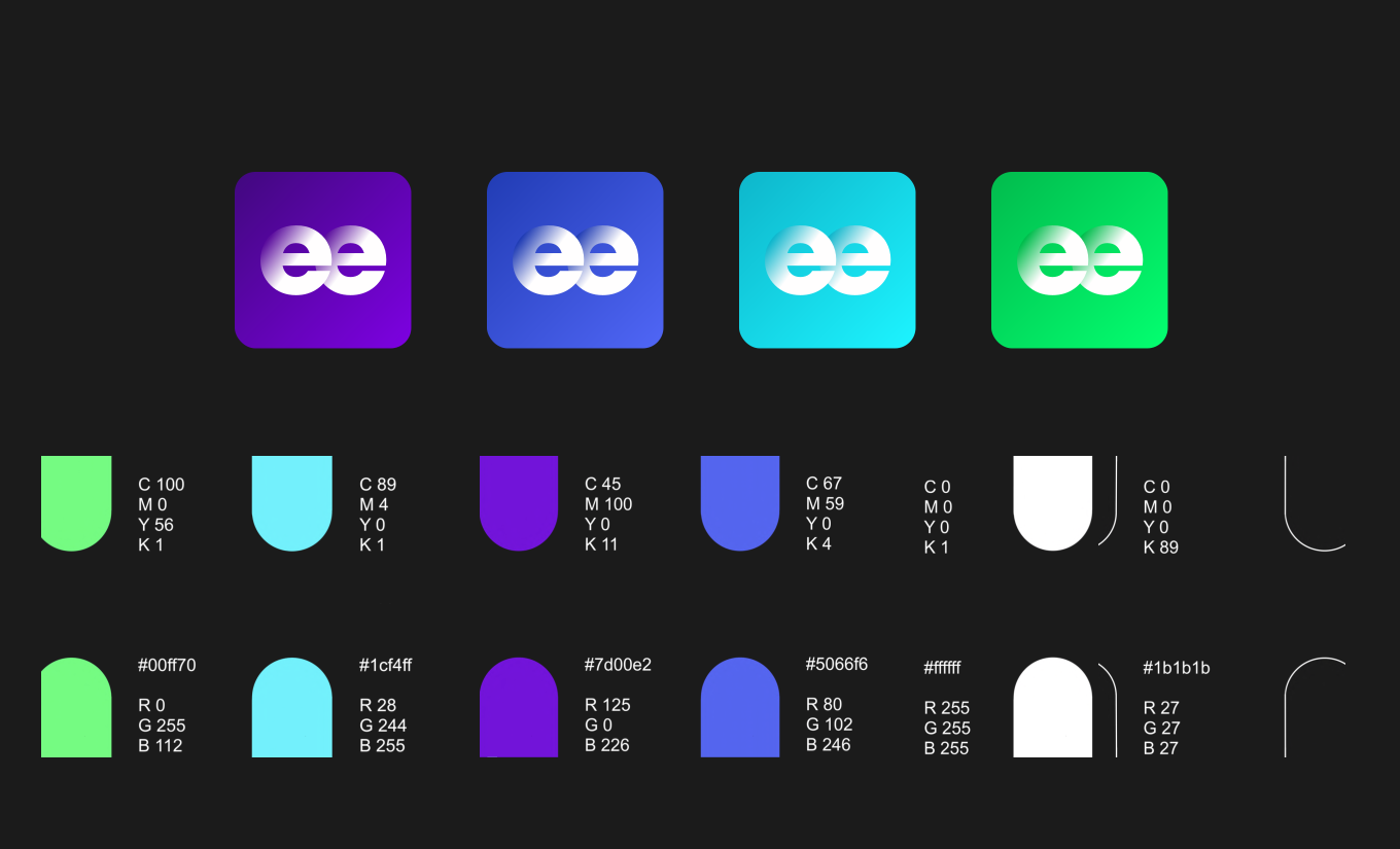
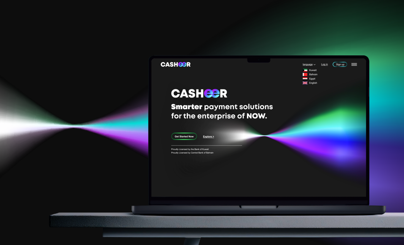
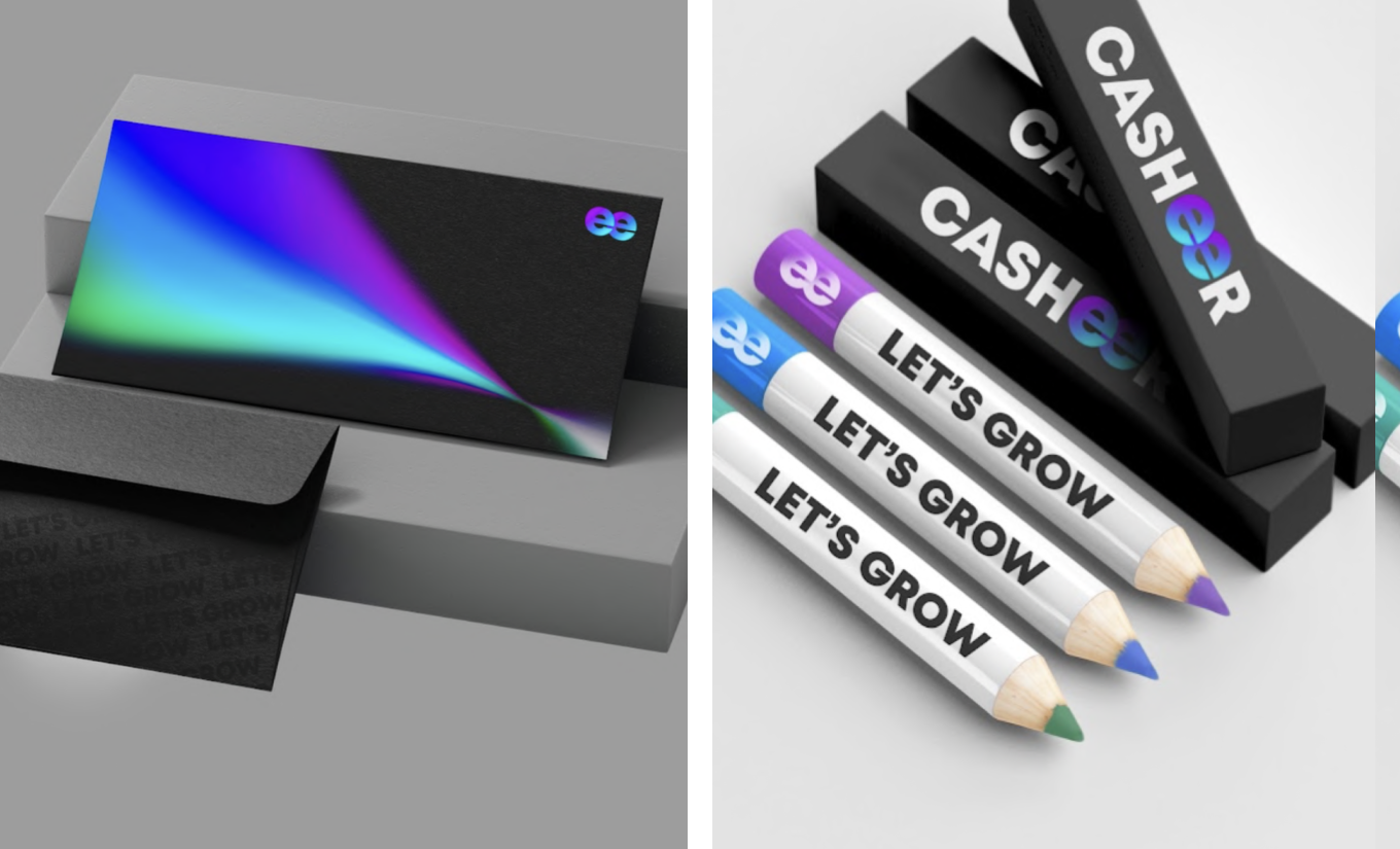
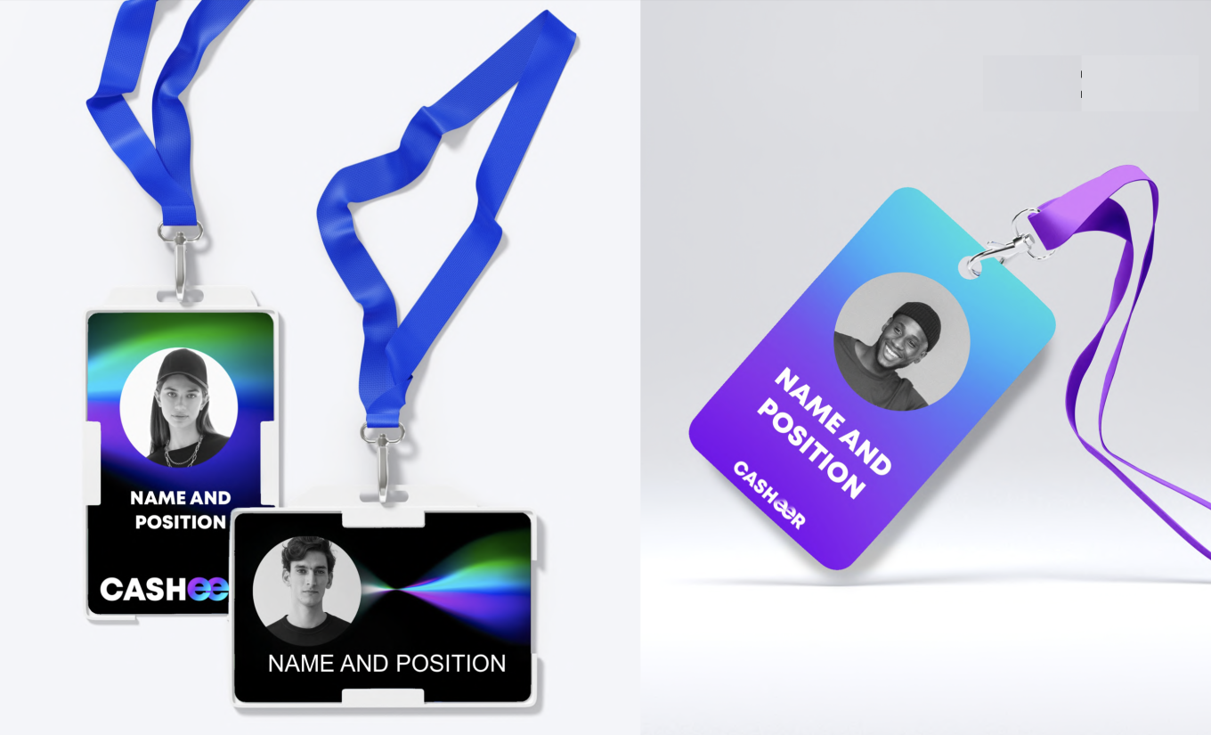
Electric purple, blue, cyan and green move across deep black backgrounds, creating an identity that feels digital, dynamic and slightly unexpected. The colour system was designed to communicate a company that is advanced, disruptive and data-driven, while individual colours also distinguish different Casheer products and services.
Simple geometric forms bring another layer to the system. Icons, navigation elements and illustrations were deliberately reduced to their essentials, reflecting the same simplicity and transparency Casheer promises through its products.
Together, these elements gave Casheer a recognisable visual language that could feel technological without becoming cold
Fintech branding can easily fall into a familiar visual language of corporate blues, rigid grids and predictable technology graphics. For Casheer, we wanted something more distinctive.
Electric purple, blue, cyan and green move across deep black backgrounds, creating an identity that feels digital, dynamic and slightly unexpected. The colour system was designed to communicate a company that is advanced, disruptive and data-driven, while individual colours also distinguish different Casheer products and services.
Simple geometric forms bring another layer to the system. Icons, navigation elements and illustrations were deliberately reduced to their essentials, reflecting the same simplicity and transparency Casheer promises through its products.
Together, these elements gave Casheer a recognisable visual language that could feel technological without becoming cold



Designed to Make Complexity Disappear
Casheer began with a straightforward ambition: make financial tools easier for businesses to use.
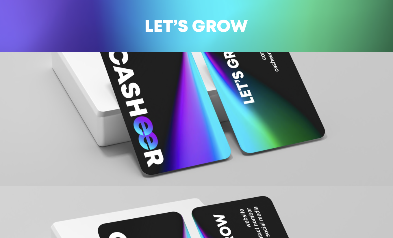
Our role was to make that promise visible. From the strategy and story behind the name to the Organic Growth concept, visual identity and its application across digital and physical touchpoints, every element was designed around the same principle — turning complexity into clarity.
The result is a fintech brand that feels confident without becoming corporate, technological without becoming inaccessible, and sophisticated without losing sight of simplicity.
At Evenage, we develop brand strategies and visual identities for fintech companies, technology startups and digital businesses, creating flexible brand systems designed to grow with the companies behind them. From positioning and storytelling to corporate identity, digital design and brand applications, we help turn complex ideas into brands people can understand, remember and trust.
If you’re building a fintech or technology brand and need a creative partner to shape its story and identity, we’d be happy to talk.
Casheer began with a straightforward ambition: make financial tools easier for businesses to use.
Our role was to make that promise visible. From the strategy and story behind the name to the Organic Growth concept, visual identity and its application across digital and physical touchpoints, every element was designed around the same principle — turning complexity into clarity.
The result is a fintech brand that feels confident without becoming corporate, technological without becoming inaccessible, and sophisticated without losing sight of simplicity.
At Evenage, we develop brand strategies and visual identities for fintech companies, technology startups and digital businesses, creating flexible brand systems designed to grow with the companies behind them. From positioning and storytelling to corporate identity, digital design and brand applications, we help turn complex ideas into brands people can understand, remember and trust.
If you’re building a fintech or technology brand and need a creative partner to shape its story and identity, we’d be happy to talk.