

(c)2025 Shanghai Evenage Business Consulting Co., Ltd. All Rights Reserved.
Business License: 9 131 0000MA1JN8DD25
Business License: 9 131 0000MA1JN8DD25
BRAND IDENTITY & CREATIVE DESIGN FOR TRAVEL
Flytern Brand Identity & Creative Branding
Brand Strategy · Visual Identity · Logo Design · Digital Design · Brand Collaterals
Building a Travel Brand for a Global Audience
Flytern was created to make travel simpler by bringing flights, hotels, and travel insurance together within one seamless platform. Our role was to develop a complete brand strategy and visual identity that could communicate reliability and ease while appealing to travelers across different markets.
The challenge was to create a brand that felt professional enough to inspire trust, yet approachable enough to become part of the everyday travel experience. From the beginning, we focused on building a flexible identity that could grow alongside Flytern and work naturally across its different services.
Flytern was created to make travel simpler by bringing flights, hotels, and travel insurance together within one seamless platform. Our role was to develop a complete brand strategy and visual identity that could communicate reliability and ease while appealing to travelers across different markets.
The challenge was to create a brand that felt professional enough to inspire trust, yet approachable enough to become part of the everyday travel experience. From the beginning, we focused on building a flexible identity that could grow alongside Flytern and work naturally across its different services.
Inspired by a Remarkable Journey
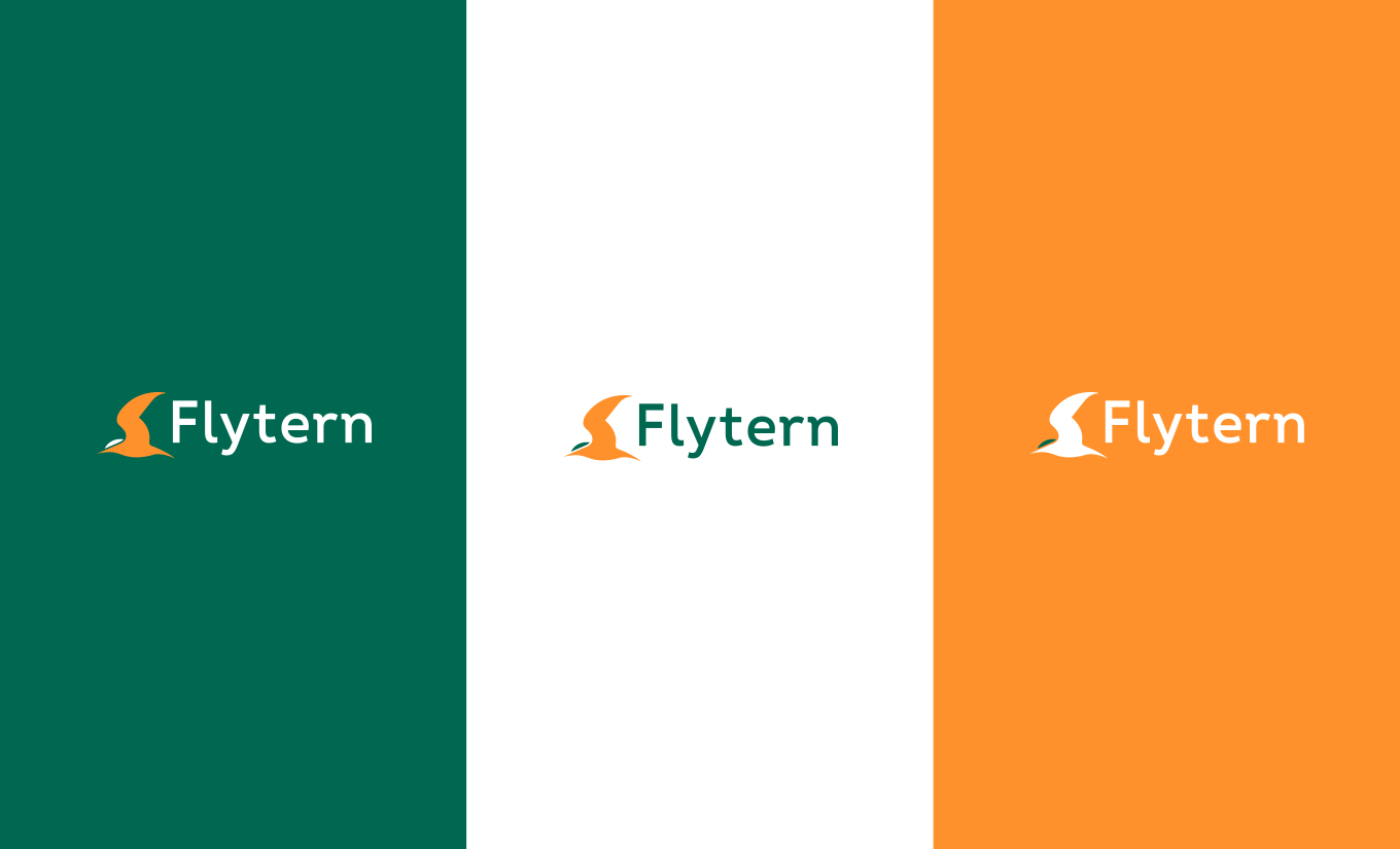
The name Flytern draws inspiration from the Arctic tern, a bird known for its extraordinary migrations across the globe. Constantly moving between distant destinations, the tern became a natural symbol for a travel brand built around exploration, freedom and connection.
This idea became the foundation of Flytern’s brand story and strategy. The journey of the tern reflects the experience Flytern wants to create for its travelers: moving confidently across borders, discovering new places and knowing that the essentials of the journey are taken care of along the way. From the name itself to the wider visual identity, the concept of movement and global connection gave us a strong narrative around which to build the brand.
The name Flytern draws inspiration from the Arctic tern, a bird known for its extraordinary migrations across the globe. Constantly moving between distant destinations, the tern became a natural symbol for a travel brand built around exploration, freedom and connection.
This idea became the foundation of Flytern’s brand story and strategy. The journey of the tern reflects the experience Flytern wants to create for its travelers: moving confidently across borders, discovering new places and knowing that the essentials of the journey are taken care of along the way. From the name itself to the wider visual identity, the concept of movement and global connection gave us a strong narrative around which to build the brand.

Going the Extra Miles
The bird gave Flytern its story, but the strategy gave that story purpose. We positioned Flytern as more than a place to book a flight: it should become a trusted travel companion, present throughout the experience with the information, services and support people need to travel with confidence.
That thinking led to the tagline “Going the extra miles.” A familiar expression takes on a new meaning for Flytern, connecting the Arctic tern’s extraordinary endurance with the brand’s commitment to doing more for its travelers. Reliability, transparency and intuitive service became central to the positioning, creating a brand designed to feel equally relevant to individual travelers and international businesses
The bird gave Flytern its story, but the strategy gave that story purpose. We positioned Flytern as more than a place to book a flight: it should become a trusted travel companion, present throughout the experience with the information, services and support people need to travel with confidence.
That thinking led to the tagline “Going the extra miles.” A familiar expression takes on a new meaning for Flytern, connecting the Arctic tern’s extraordinary endurance with the brand’s commitment to doing more for its travelers. Reliability, transparency and intuitive service became central to the positioning, creating a brand designed to feel equally relevant to individual travelers and international businesses

Giving Flytern Its Wings
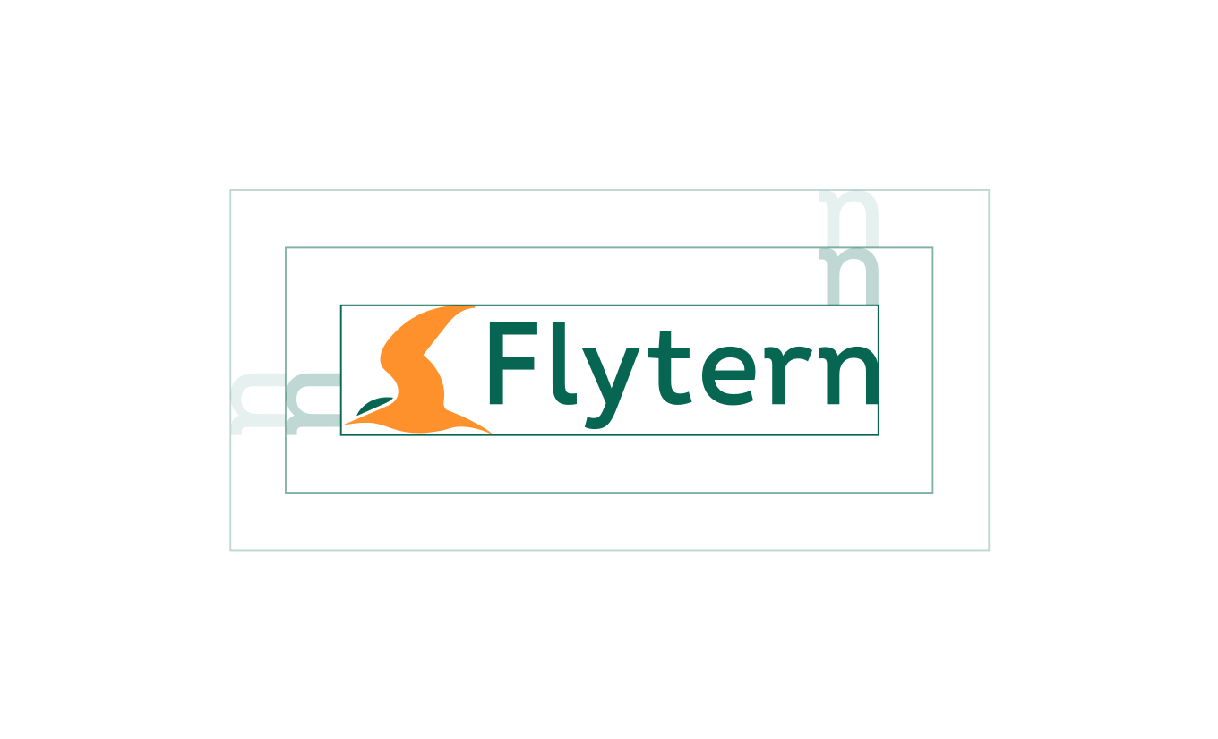
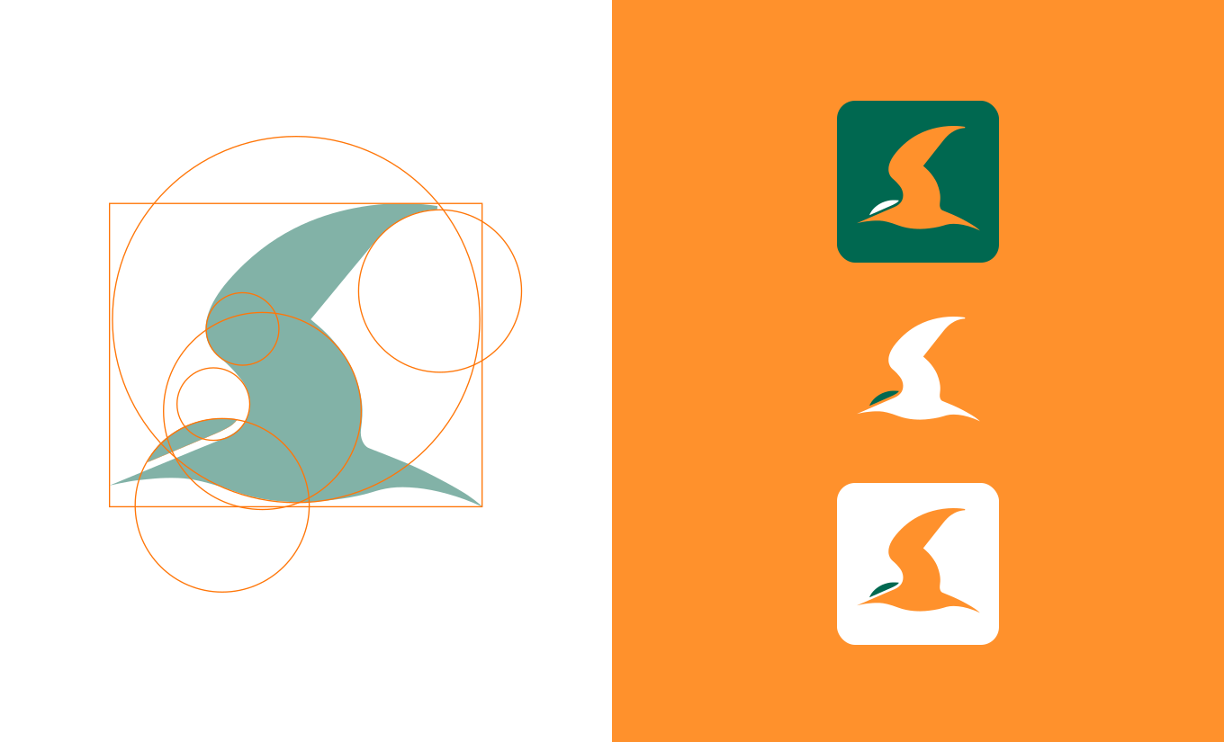
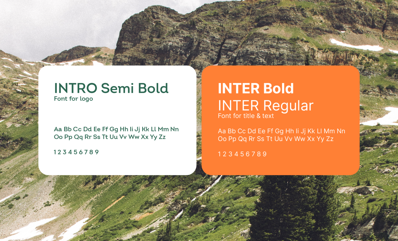
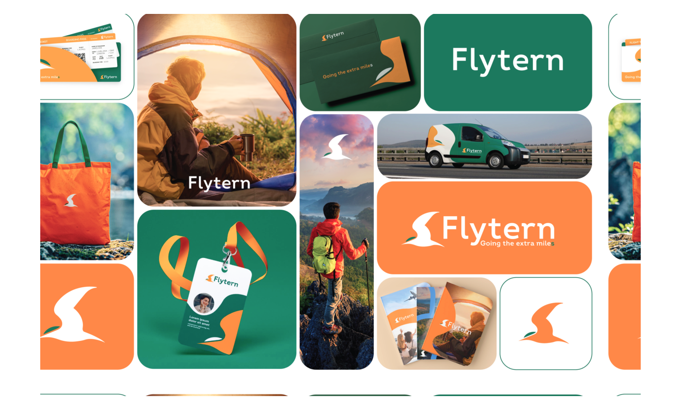
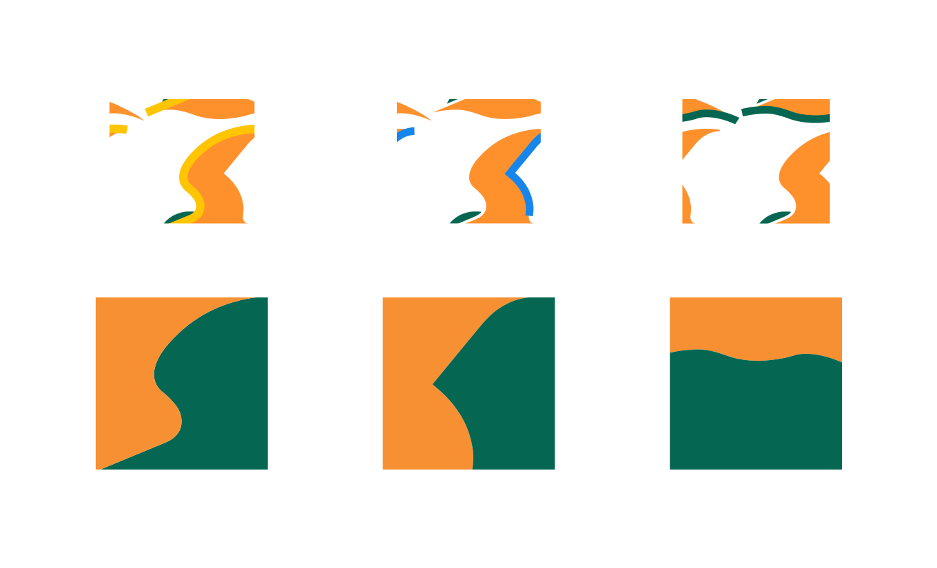
We carried the idea into a visual identity that could become unmistakably Flytern. At its center is the Tern itself: developed not simply as part of the logo, but as a standalone brand icon that can represent Flytern even when space is limited. Together with the wordmark, it gives the brand a distinctive visual signature that can travel naturally across different applications.
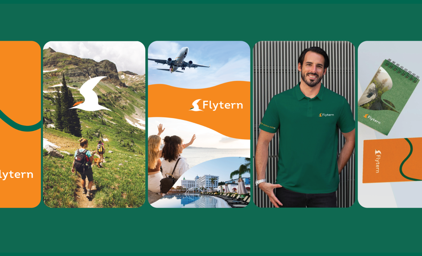
The identity was then built into a consistent system for digital and marketing communication, from the website and social media to wider brand touchpoints. Even the language became part of the experience: “It’s your turn… to Flytern” was created as a recurring invitation to move from planning to travelling. The result is a brand where story, strategy, identity and communication all speak the same language.
We carried the idea into a visual identity that could become unmistakably Flytern. At its center is the Tern itself: developed not simply as part of the logo, but as a standalone brand icon that can represent Flytern even when space is limited. Together with the wordmark, it gives the brand a distinctive visual signature that can travel naturally across different applications.
The identity was then built into a consistent system for digital and marketing communication, from the website and social media to wider brand touchpoints. Even the language became part of the experience: “It’s your turn… to Flytern” was created as a recurring invitation to move from planning to travelling. The result is a brand where story, strategy, identity and communication all speak the same language.


A Brand Ready to Go Further
From brand strategy and storytelling to visual identity and communication, every element of Flytern was developed around one clear idea: creating a travel brand people can rely on wherever their journey takes them.
By turning the spirit of the Arctic tern into a complete brand world, we created an identity that is distinctive, flexible and built to grow. Flytern now has a strong foundation for communicating across markets, services and touchpoints while remaining recognizably its own — a brand created to go the extra miles.
Whether you’re building a new brand or giving an existing one a fresh direction, we can help turn your ideas into a clear, distinctive identity. From brand strategy and storytelling to visual identity and creative design, we create brands that connect with the right audience and are built to grow across markets.
Let’s create something meaningful together.
From brand strategy and storytelling to visual identity and communication, every element of Flytern was developed around one clear idea: creating a travel brand people can rely on wherever their journey takes them.
By turning the spirit of the Arctic tern into a complete brand world, we created an identity that is distinctive, flexible and built to grow. Flytern now has a strong foundation for communicating across markets, services and touchpoints while remaining recognizably its own — a brand created to go the extra miles.
Whether you’re building a new brand or giving an existing one a fresh direction, we can help turn your ideas into a clear, distinctive identity. From brand strategy and storytelling to visual identity and creative design, we create brands that connect with the right audience and are built to grow across markets.
Let’s create something meaningful together.