

(c)2025 Shanghai Evenage Business Consulting Co., Ltd. All Rights Reserved.
Business License: 9 131 0000MA1JN8DD25
Business License: 9 131 0000MA1JN8DD25
BRAND STRATEGY & VISUAL IDENTITY FOR FINTECH
Squaircle by One Global Holding –
Fintech Brand Identity
Brand Strategy · Visual Identity · Graphic Design · Digital & Offline Applications
Branding for Fintech
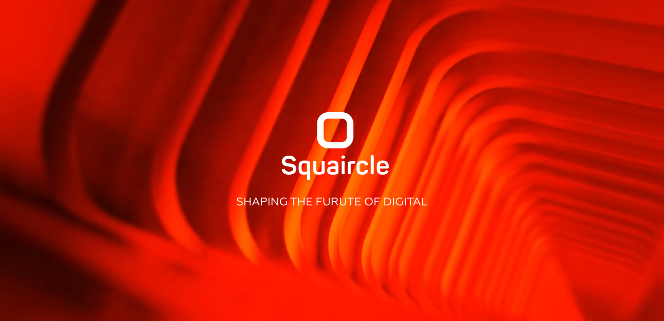
Squaircle is a technology company by One Global Holding focused on digital solutions designed to help businesses and organisations navigate an increasingly complex digital world.
We worked with Squaircle to develop its brand strategy and visual identity, creating a clear foundation for how the company presents itself, communicates and grows. The goal was to build a brand that could express innovation and technological expertise while remaining approachable, confident and distinctly human.
From strategic positioning and brand messaging to the visual language and its application across digital and physical touchpoints, we created a flexible identity designed to grow together with the business.
Squaircle is a technology company by One Global Holding focused on digital solutions designed to help businesses and organisations navigate an increasingly complex digital world.
We worked with Squaircle to develop its brand strategy and visual identity, creating a clear foundation for how the company presents itself, communicates and grows. The goal was to build a brand that could express innovation and technological expertise while remaining approachable, confident and distinctly human.
From strategic positioning and brand messaging to the visual language and its application across digital and physical touchpoints, we created a flexible identity designed to grow together with the business.

Turning Complexity into a Brand Idea
The strategy began with the meaning behind the Squaircle name itself — inspired by the idea of “squaring the circle,” a problem historically associated with attempting something seemingly impossible.
This became a natural metaphor for the brand: approaching complex challenges from a different perspective and using technology, creativity and expertise to find solutions. We developed the positioning around innovation, problem-solving and collaboration, while keeping human connection at the centre of the brand.
The strategy began with the meaning behind the Squaircle name itself — inspired by the idea of “squaring the circle,” a problem historically associated with attempting something seemingly impossible.
This became a natural metaphor for the brand: approaching complex challenges from a different perspective and using technology, creativity and expertise to find solutions. We developed the positioning around innovation, problem-solving and collaboration, while keeping human connection at the centre of the brand.

A Visual Language Built Around the Squaircle
The graphic concept grew directly from this strategic idea. During the creative process, we explored several directions — from geometric 2D compositions to dimensional graphics and impossible forms — looking for a visual language that could communicate both structure and transformation.
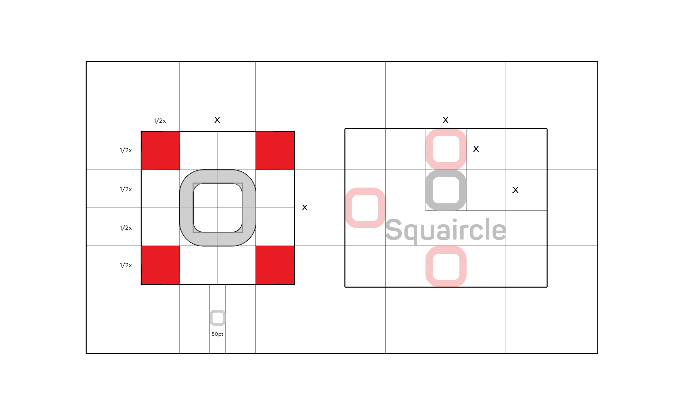
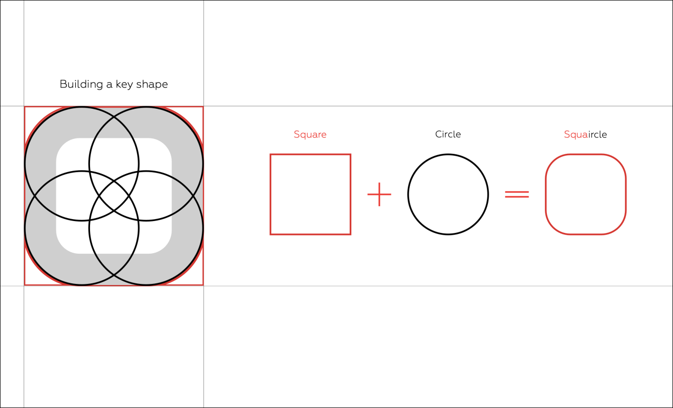
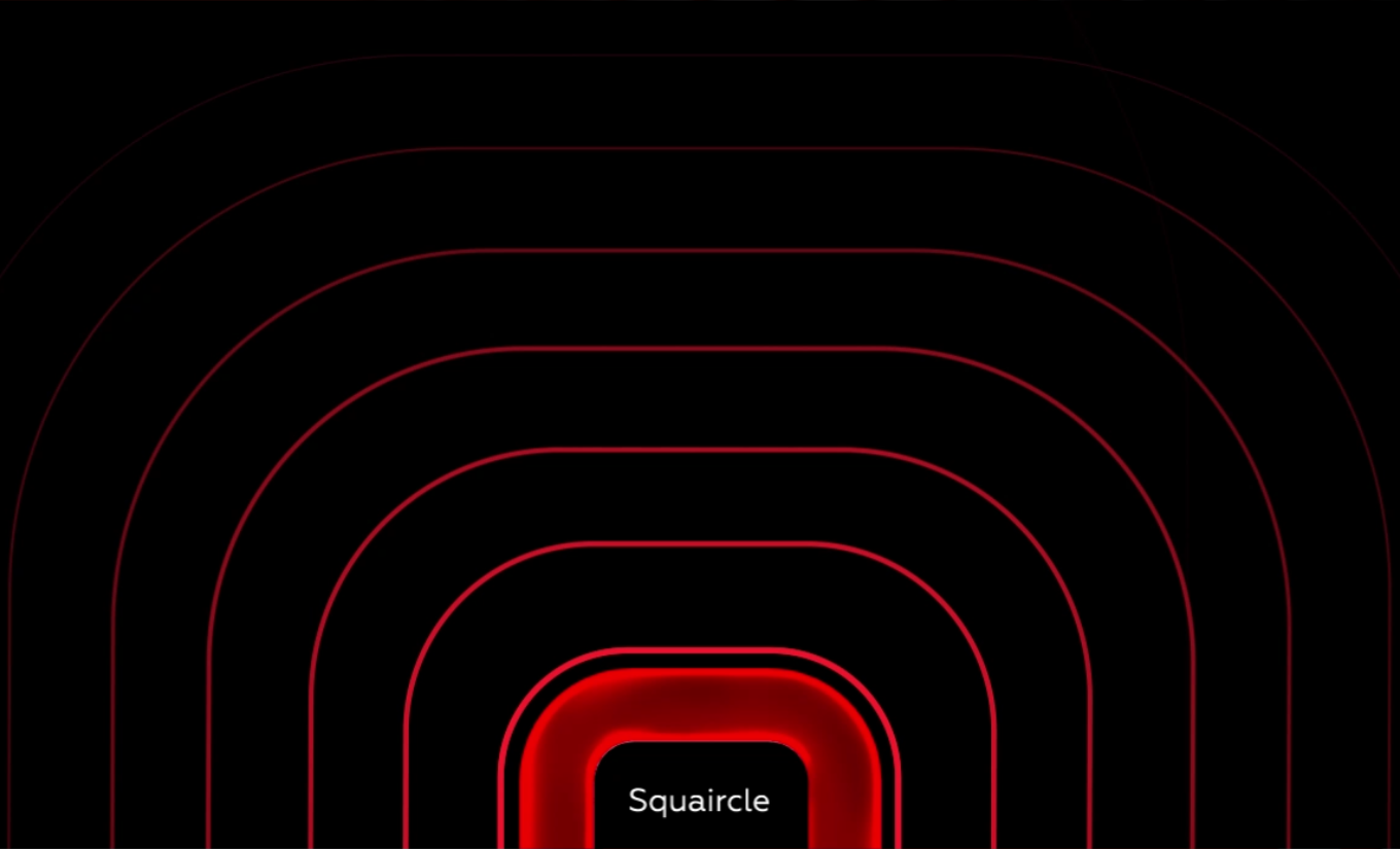
At the centre of the final identity is the Squaircle shape itself: a meeting point between a square and a circle. Its geometry became more than a logo — it developed into a flexible graphic system of curves, frames, repetitions and three-dimensional forms.
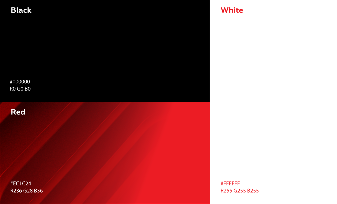
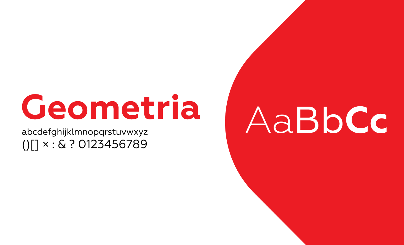
A bold palette of red, black and white, combined with sculptural 3D graphics and structured typography, gave the identity a distinctly digital character while keeping the system simple enough to remain recognisable across different formats. The final brand guidelines formally define the key shape as the combination of the square and circle.
The graphic concept grew directly from this strategic idea. During the creative process, we explored several directions — from geometric 2D compositions to dimensional graphics and impossible forms — looking for a visual language that could communicate both structure and transformation.
At the centre of the final identity is the Squaircle shape itself: a meeting point between a square and a circle. Its geometry became more than a logo — it developed into a flexible graphic system of curves, frames, repetitions and three-dimensional forms.
A bold palette of red, black and white, combined with sculptural 3D graphics and structured typography, gave the identity a distinctly digital character while keeping the system simple enough to remain recognisable across different formats. The final brand guidelines formally define the key shape as the combination of the square and circle.

From Digital Screens to the Physical World
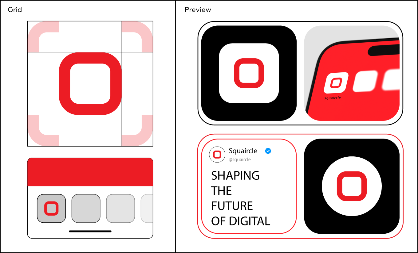
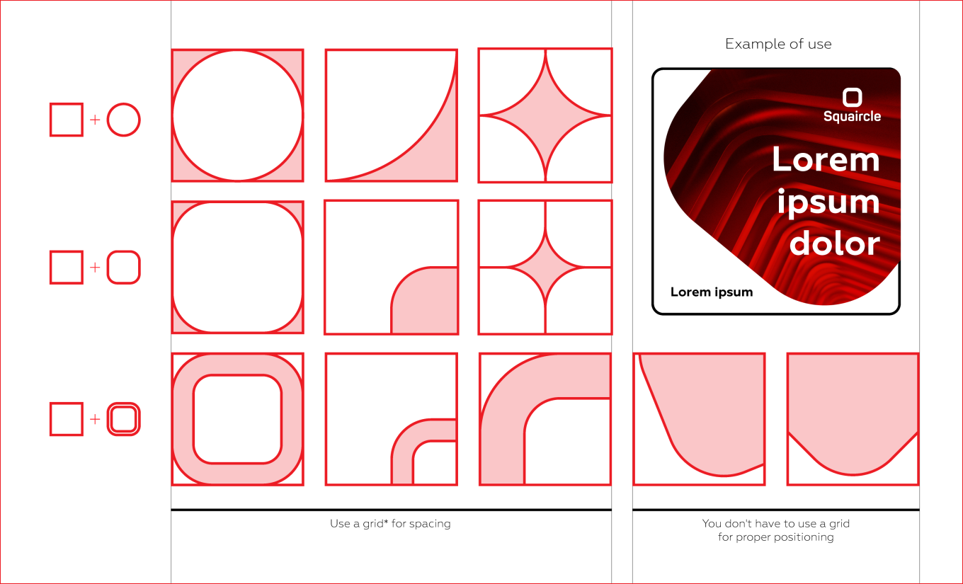
The identity was designed as a system rather than a collection of individual graphics. We developed rules for the logo, colour palette, typography, grid, imagery and graphic elements so that the brand could remain consistent while adapting to very different contexts.
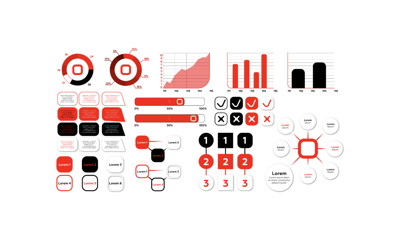
We then brought the system into both digital and physical applications — including web and social media graphics, digital banners, presentations and screen environments, as well as business cards, brochures, stationery, badges, merchandise and other branded materials.
Across every application, the same visual language connects the experience back to Squaircle: structured but flexible, technological but human, and immediately recognisable
The identity was designed as a system rather than a collection of individual graphics. We developed rules for the logo, colour palette, typography, grid, imagery and graphic elements so that the brand could remain consistent while adapting to very different contexts.
We then brought the system into both digital and physical applications — including web and social media graphics, digital banners, presentations and screen environments, as well as business cards, brochures, stationery, badges, merchandise and other branded materials.
Across every application, the same visual language connects the experience back to Squaircle: structured but flexible, technological but human, and immediately recognisable


Building a Brand for What Comes Next
For us, the Squaircle project was not simply about creating a new look. It was about translating a business idea into a complete brand system — from strategy and positioning to the smallest visual details.
The result is an identity designed to evolve alongside the company: distinctive enough to build recognition, flexible enough to work across markets and platforms, and grounded in the same idea that shaped the brand from the beginning — finding clarity and possibility within complexity.
For us, the Squaircle project was not simply about creating a new look. It was about translating a business idea into a complete brand system — from strategy and positioning to the smallest visual details.
The result is an identity designed to evolve alongside the company: distinctive enough to build recognition, flexible enough to work across markets and platforms, and grounded in the same idea that shaped the brand from the beginning — finding clarity and possibility within complexity.



Looking for a Creative Branding Agency?
At Evenage, we create brand identities for startups, technology companies and growing businesses looking for more than a logo.
From brand strategy and positioning to visual identity, graphic systems and digital and offline applications, we build brands as complete, adaptable systems. Working across cultures and markets, our approach combines strategic thinking with creative design to create identities that feel relevant wherever they need to live.
Let’s build a brand with somewhere to go.
At Evenage, we create brand identities for startups, technology companies and growing businesses looking for more than a logo.
From brand strategy and positioning to visual identity, graphic systems and digital and offline applications, we build brands as complete, adaptable systems. Working across cultures and markets, our approach combines strategic thinking with creative design to create identities that feel relevant wherever they need to live.
Let’s build a brand with somewhere to go.