

(c)2025 Shanghai Evenage Business Consulting Co., Ltd. All Rights Reserved.
Business License: 9 131 0000MA1JN8DD25
Business License: 9 131 0000MA1JN8DD25
BRAND IDENTITY & DIGITAL MARKETING FOR CHINA
Unici: Bringing the Soul of Italy to China
Brand Visual Identity · Website Design · Xiaohongshu Marketing Strategy
More Than Italian Products. A Piece of Italy.
Unici began with an idea bigger than retail: to introduce China to a side of Italy that is rarely found in mainstream stores — independent artisans, family workshops, beautiful objects and traditions shaped over generations.
Our task was to turn that idea into a distinctive brand experience for the Chinese market. We developed Unici’s brand visual identity, website and Xiaohongshu marketing direction, creating one coherent world in which products are discovered through the people, places and stories behind them. The positioning became clear: rare Italy, curated for China.
Unici began with an idea bigger than retail: to introduce China to a side of Italy that is rarely found in mainstream stores — independent artisans, family workshops, beautiful objects and traditions shaped over generations.
Our task was to turn that idea into a distinctive brand experience for the Chinese market. We developed Unici’s brand visual identity, website and Xiaohongshu marketing direction, creating one coherent world in which products are discovered through the people, places and stories behind them. The positioning became clear: rare Italy, curated for China.
Turning Italian Life Into a Visual Language
Rather than creating the visual world around conventional ideas of luxury, we looked at Italy itself: Mediterranean blues, warm sunlight, striped awnings, handwritten notes, postcards, ceramics, workshops and the slightly imperfect charm of things made by hand.
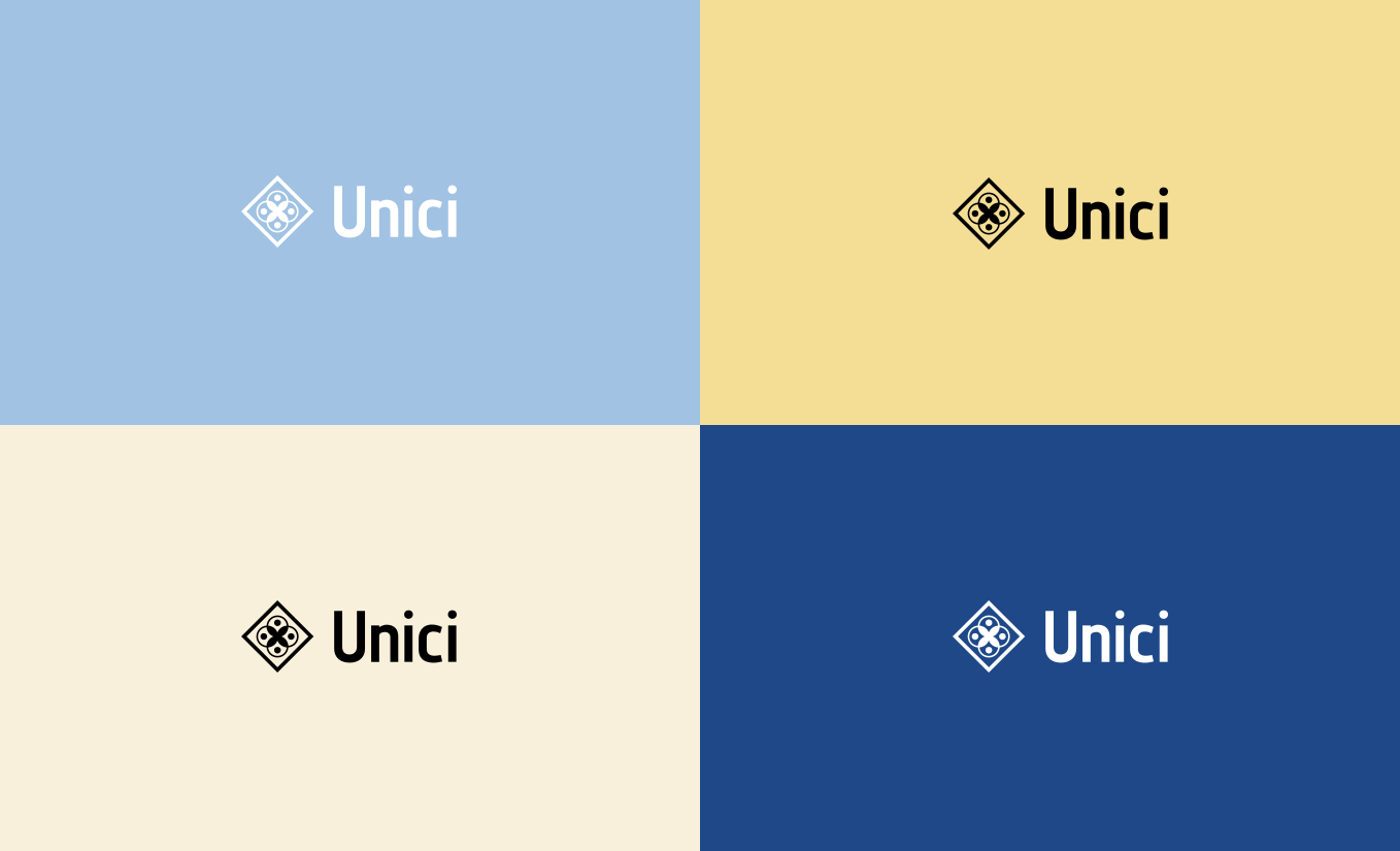
This became a playful editorial identity built from blue, soft yellow and warm neutral tones, Italian-inspired stripes and patterns, expressive typography, photography and layered collage compositions. The system was designed to feel curated rather than corporate — almost like fragments collected during a journey through Italy.
Rather than creating the visual world around conventional ideas of luxury, we looked at Italy itself: Mediterranean blues, warm sunlight, striped awnings, handwritten notes, postcards, ceramics, workshops and the slightly imperfect charm of things made by hand.
This became a playful editorial identity built from blue, soft yellow and warm neutral tones, Italian-inspired stripes and patterns, expressive typography, photography and layered collage compositions. The system was designed to feel curated rather than corporate — almost like fragments collected during a journey through Italy.


One Italian Story, Told Everywhere
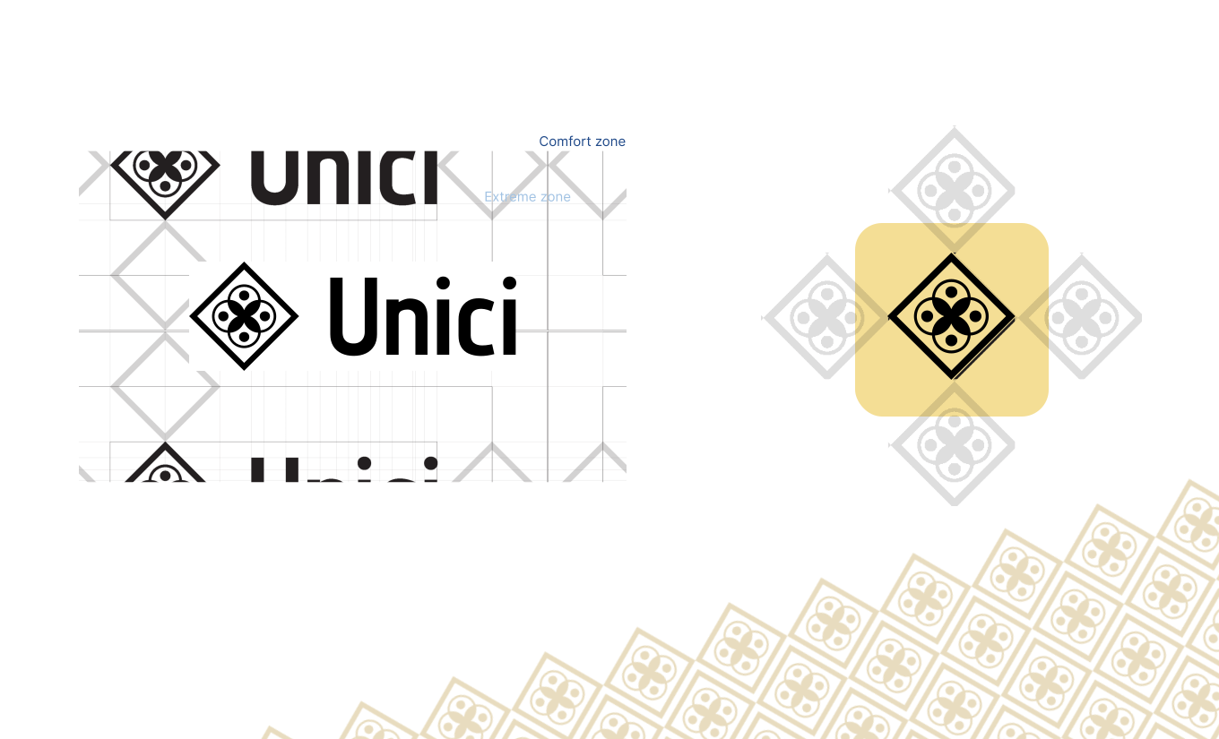
From the website and social media to packaging and printed collateral, every expression of Unici was designed to feel like part of the same world — warm, distinctive, curious and unmistakably Italian.
The result is more than a visual identity. It is a complete brand language that gives Unici the flexibility to communicate across different channels while keeping one consistent story at its heart: discovering Italy through its people, places, craftsmanship and everyday beauty.
From the website and social media to packaging and printed collateral, every expression of Unici was designed to feel like part of the same world — warm, distinctive, curious and unmistakably Italian.
The result is more than a visual identity. It is a complete brand language that gives Unici the flexibility to communicate across different channels while keeping one consistent story at its heart: discovering Italy through its people, places, craftsmanship and everyday beauty.


One Italian Story, Told Everywhere
From the website and social media to packaging and printed collateral, every expression of Unici was designed to feel like part of the same world — warm, distinctive, curious and unmistakably Italian.
The result is more than a visual identity. It is a complete brand language that gives Unici the flexibility to communicate across different channels while keeping one consistent story at its heart: discovering Italy through its people, places, craftsmanship and everyday beauty.
From the website and social media to packaging and printed collateral, every expression of Unici was designed to feel like part of the same world — warm, distinctive, curious and unmistakably Italian.
The result is more than a visual identity. It is a complete brand language that gives Unici the flexibility to communicate across different channels while keeping one consistent story at its heart: discovering Italy through its people, places, craftsmanship and everyday beauty.


Bringing the Story Together
For Unici, the goal was never simply to create a beautiful identity, but to build a complete brand world around the spirit of Italy. From visual identity and digital presence to content, packaging and brand collateral, every touchpoint was designed to carry the same sense of discovery, craftsmanship and character.
The result is a flexible brand that can continue to grow across markets, platforms and experiences while staying true to its central idea: bringing the stories, traditions and everyday beauty of Italy closer to people around the world.
For Unici, the goal was never simply to create a beautiful identity, but to build a complete brand world around the spirit of Italy. From visual identity and digital presence to content, packaging and brand collateral, every touchpoint was designed to carry the same sense of discovery, craftsmanship and character.
The result is a flexible brand that can continue to grow across markets, platforms and experiences while staying true to its central idea: bringing the stories, traditions and everyday beauty of Italy closer to people around the world.